Packaging & Merchandising Design - project 2
Packaging & Merchandising Design - project 2
Week 4—10
Ke Bo Zhi / 0362533
Bachelor of Design (Hons) in Creative Media
project 2
Product Analysis
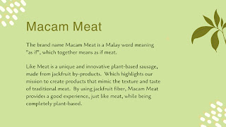
In the first week I participated in the teams meeting organized by the task to learn about and do the task I needed to design the packaging products for it. This product is a sausage made from the pulp of barama and its by-products as raw material (100% plant-based).
Box design expectations
Visual Reference
Figure1.1 :visual Reference
Figure1.4 :visual Reference
After learning about the product and the visual references, I started to draft the product box.
Rough draft
After consulting the teacher, I combined the advantages of several drafts and made some improvements and finished my final draft after the course.
Final draft
Figure1.5 :draft1
Figure1.6 :draft2
Figure1.7 :draft3
Final draft
Figure1.9 :draft5
Progress
Figure2.1 :Art Direction (Typeface)
Figure2.2 :Art Direction (Color card)
Figure2.3 :product presentation
After thinking of the packaging colors, fonts and additional elements I wanted to use, I started to design the packaging. I used Pulomi-like colors (yellow and green) for the packaging and made a font for two weeks for the logo, but in the end, I chose a round font because it looked more like sausage.
In the following week, after learning from the suggestions of the teacher and the team, I began to design the back of the package and the information, and I decided to add a real photo on the front, so as to arouse the customer's desire to buy.
After I finished all the design, I followed the teacher's advice and made some improvements to make the package look more perfect.
Figure2.8 :Back of package
Figure2.9 :Front of package
Figure2.10 :packaging
FINAL SUBMISSION
ppt
Mockup
FEEDBACK
WEEK8
Add some visual references, make the packaging look richer, and experiment with some font, layout and typography combinations.
WEEK9
Then think about the logo and the font of the package and do some experiments and matches.
WEEK10
Pay attention to the position of the typesetting, and some elements on the packaging can be modified appropriately.
WEEK11
Adding a high-definition physical image and putting some information into a dialog box can make the package look more comfortable.
REFLECTION
Experience
In this task, I needed to design a package for the product of the team cooperation. I found that it was not a simple thing to design the package, and I had to constantly modify my design according to the needs of the team and the opinions of the teacher. At the beginning, I chose a more common packaging to determine my layout, and then changed to a more characteristic packaging design under the guidance of the teacher.
Observation
In the design of this package need to pay attention to a lot of things, such as the location of the layout and some necessary information, in the design to ensure that the visual effect and the location of the information is correct and how to ensure the improvement of product information and ensure that customer service can intuitively understand the content of the product is very important.
Findings
I learned a lot from this assignment, and I also found that what I learned in other courses could be applied to this assignment. When communicating with the team, they would correct me in time when I didn't understand the packaging rules and grammar mistakes. In general, it was a rewarding experience.


评论
发表评论